A Complete Guide to Snapchat Text Fonts
Over 5 billion Snaps are created each day — use the same font across all your social channels

Snapchat has always stood out from other social media platforms as a unique way to capture and share content with others. By introducing features like temporary stories and text overlays, Snapchat set the standard for ephemeral content, inspiring other platforms to follow suit.
Recently, Snapchat has been taking cues from sites like TikTok and Instagram, adding additional advanced editing tools and even integrating their own algorithm-based video feed. Among these updates is the introduction of new fonts and text options to better customize photos and videos before sharing.
In this article, we will take a look at how to use Snapchat's different fonts and how to find similar styles to scale across your other social media content.
Table of Contents
- What Font Does Snapchat Use?
- How to Change Fonts on Snapchat
- How to Change Font Size on Snapchat (Bigger and Smaller)
- Finding Snapchat Text Fonts for Other Projects
What Font Does Snapchat Use?
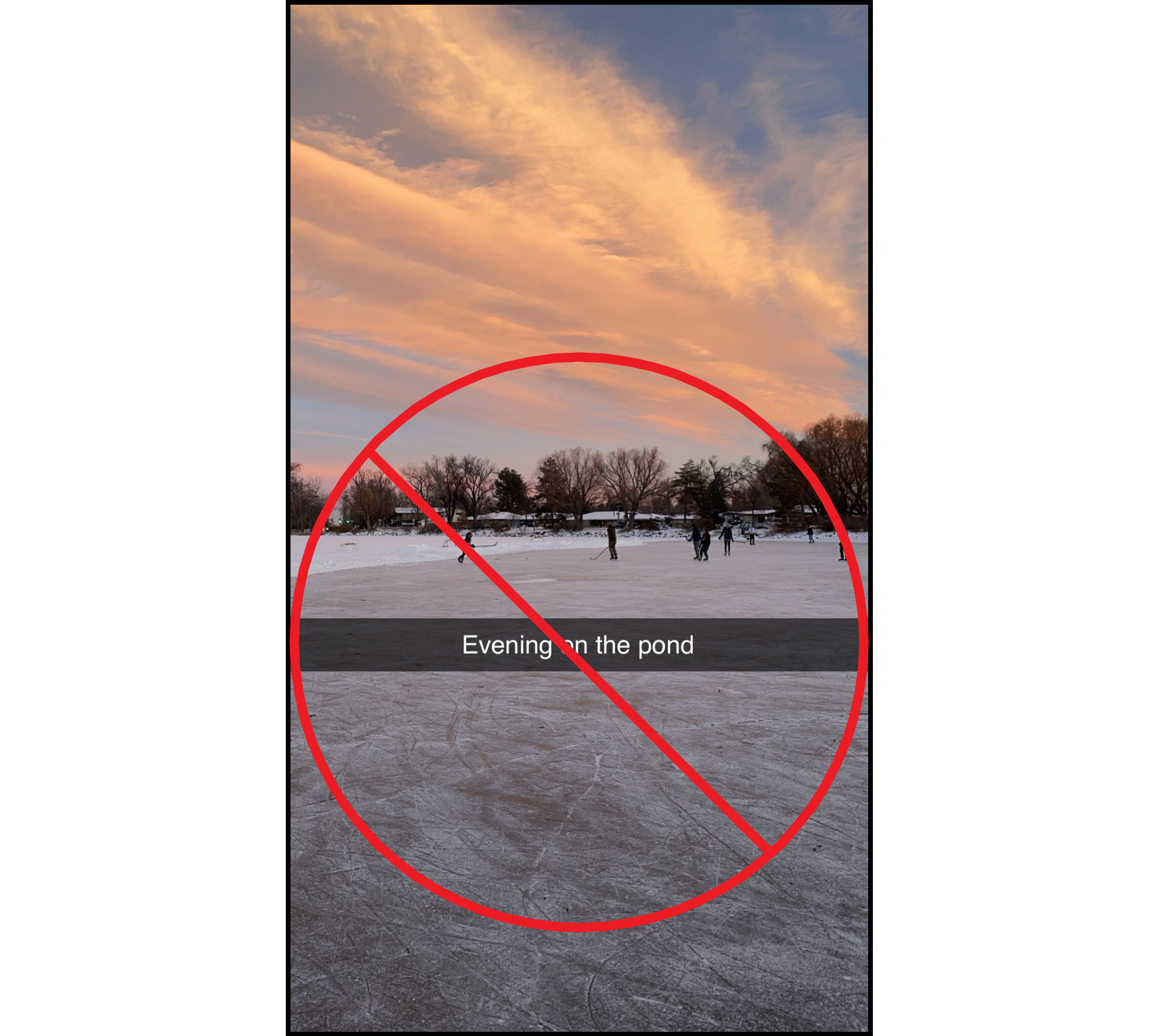
When you edit content on Snapchat — whether it's a photo, video, or just a blank canvas — the first font that appears by default is Snapchat Sans. This proprietary typeface was designed specifically for the platform and is instantly recognizable as the font used in Snapchat’s iconic caption bars.
To use it, simply tap anywhere on your Snap to bring up the text tool and start typing. While Snapchat offers a variety of font styles that you can cycle through by swiping left or right, Snapchat Sans is always the default. It’s clean, minimal, and optimized for readability on-screen, making it ideal for fast captions and one-liners.
Visually, Snapchat Sans appears as white text inside a semi-transparent gray bar, a style that helps captions stand out without fully covering your content.

For those looking to recreate this look outside the app, there are a couple of reliable alternatives:
- Avenir is the closest commercial match to Snapchat Sans and is available for purchase through several font marketplaces.
- Public Sans is a free alternative that mirrors the structure and simplicity of Snapchat Sans and can be downloaded through Google Fonts. It is also available directly within the Kapwing editor for you to recreate the classic Snapchat style on videos and images.

In total, Snapchat includes 11 different fonts for text editing, which we’ll explore later in this guide. But for most users, Snapchat Sans remains the most iconic, and the one most closely tied to the app’s signature style.
How to Change Fonts on Snapchat
Changing your font on Snapchat is simple and can be done in just a few taps. After adding a photo, video, or blank canvas, tap anywhere on the screen to bring up the text tool. The font options will appear in a scrollable list just above your keyboard.
To switch fonts, swipe left or right through the available options until you find one that fits your style. Once selected, you can continue customizing the text by adjusting its color, size, and placement on the screen.
The video below shows a quick example of this process — from tapping to add text, to swiping between fonts and experimenting with alternative stylings.
Access different Snapchat fonts by selecting them from the font bar just above your keyboard.
As shown at the end of the video, you can delete your text at any time by dragging it to the bottom of the screen and releasing it over the trash can icon.
Font Alignment and Outlining
To make your text stand out on Snapchat, you can adjust the alignment and add an outline directly from the editing menu. These tools are located in the top-right corner of the screen when you're in text mode.
Starting with alignment, tap the icon that controls how your text is positioned. Each tap will cycle through centered, left-aligned, and right-aligned text.
This gives you more control over how your caption is framed, especially helpful when working with multi-line text or placing captions in specific areas of your Snap.

Just beneath the alignment tool is the outline button, marked with an “Aa” icon.
Tapping this will instantly apply a dark outline to your text, helping it pop against brighter or more complex backgrounds.

While the outline color itself can't be changed, it adds a strong visual contrast that’s particularly useful for headings, callouts, or video titles where readability is important.
How to Change Font Size on Snapchat (Bigger and Smaller)
To change the size of a font on Snapchat, you'll need to ensure you're using the correct font style.
The default style, the grey transparent text bar, cannot be resized.
Instead, you'll need to use a free-floating text, which can be accessed by either switching fonts or by tapping the ABC icon to change the style of your current font.
Then, resizing is as simple as pinching and zooming.
Using two fingers, you can drag and drop your text anywhere on the screen, pinching to make it larger and pushing to make it smaller.
Using this same process, you can also rotate your font to fit it anywhere on your screen as desired.

This is also the easiest way to reposition text anywhere on the screen. The only challenge with this editing style is managing multiple layers at once. Since Snapchat lets you stack graphics, text, and effects, effectively turning static images into short videos, it’s a quick and simple way to create content like invitations, celebration cards, or birthday shoutouts.
As an example of this, I built a party invitation entirely within Snapchat's editor, adding several layers, along with resized text.
Snapchat offers easy to use graphics and stickers but with an unintuitive editing process.
Notably, as more and more layers were introduced, it became very difficult to access them individually, as attempting to grab some text resulted in accidentally interacting with another layer, which changed how they overlapped with one another, posing a significant setback.
Considering this, if you are attempting to build an image with multiple layers of text and graphics, it is best to use a dedicated Image Editor that is built for creating content with ease and simplicity in mind.
Finding Snapchat Text Fonts for Other Projects
Snapchat lacks advanced typography features like custom font uploads, drop shadows, transparent backgrounds, and editable outlines. These gaps can make it difficult to maintain consistent branding, especially when designing content for multiple platforms.
To work around this, the guide below pairs each Snapchat font with a free alternative you can use in external editors. These matches give you more control over size, spacing, outline color, and overall styling.
Note: The fonts available on Snapchat are not named and do not appear in the same order for everyone. Instead, fonts are sorted by recency, meaning whichever font you have used most recently will appear first in the list. The exception is the default font, which always appears first in the font list.
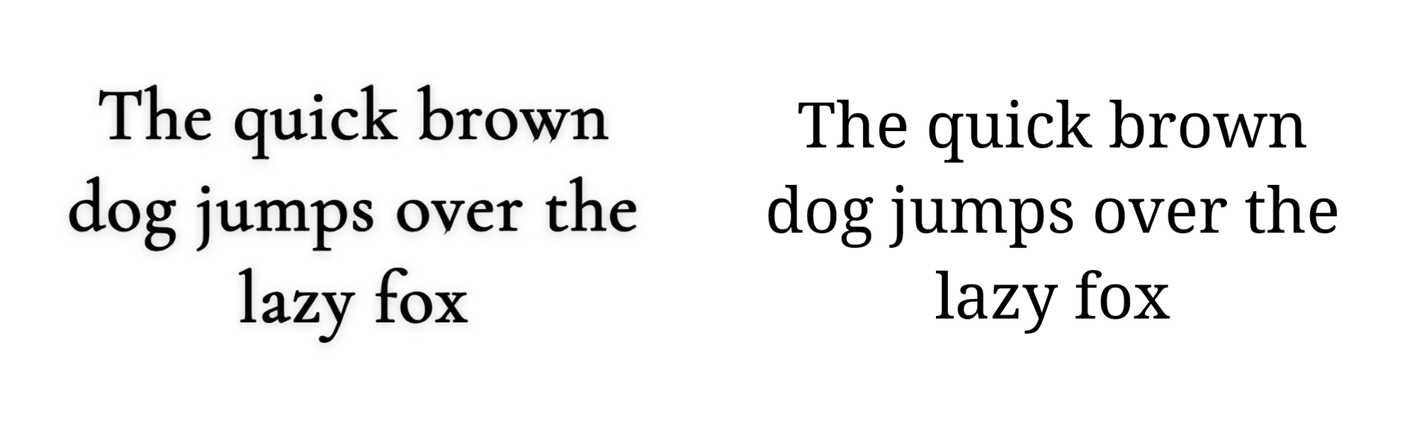
The Default Font — Public Sans
Snapchat’s default font appears in a semi-transparent gray text bar with white lettering. While the official font is Snapchat Sans, the closest free alternative is Public Sans. It closely mirrors the proportions and spacing of the default, with the only noticeable difference being the curved tail of the letter “g.”

From this point on, the fonts have been organized by font weight, starting with lighter, more elegant fonts and ending with bold, high-impact styles.
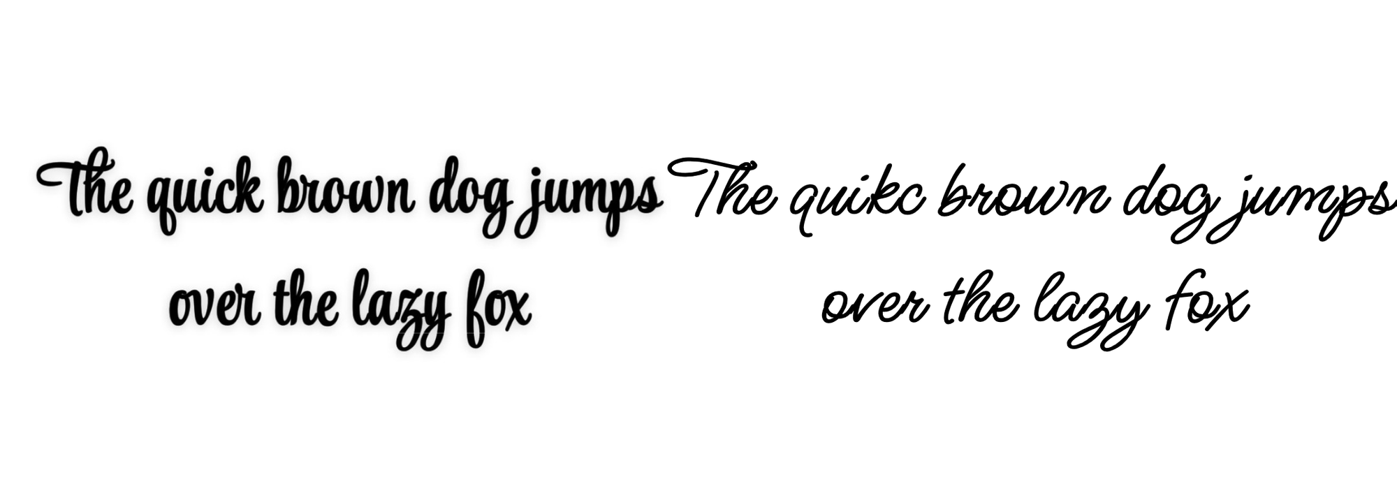
Font Option 1 — Bad Script

This handwritten style is delicate and expressive, ideal for adding a personal touch. It’s best matched with Bad Script, which mirrors the letter curves and signature details, especially on letters like “j” and “f.”
Font Option 2 — Comorant Upright

With a slightly italicized design and elevated contrast between strokes, this Snapchat font pairs well with Cormorant Upright. It gives off a balanced tone—refined, but not overly formal.
Font Option 3 — Comic Neue

This friendly, informal font resembles Comic Sans but with a cleaner design. Comic Neue makes for a near-exact replica and brings a casual vibe that works well for jokes, memes, and fun captions.
Font Option 4 — Noto Serif Georgian
A more structured serif font used in Snapchat’s lineup, this style is best replicated by Noto Serif Georgian. With sharp edges and balanced spacing, it’s perfect for more formal or professional-style Snaps.
Font Option 5 — Ms Madi
For a playful and expressive look, this cursive-style Snapchat font is best matched with Ms Madi. It blends script and handwritten aesthetics but should be used sparingly to ensure readability, especially on smaller screens.
Font Option 6 — Armino

This clean, modern sans-serif font offers high legibility, making it ideal for on-screen captions or automatic captions. The Arimo font provides a close match with excellent clarity and versatility.
Font Option 7 — Pixelify Sans
If you’re after a quirky, retro-inspired look, this Snapchat font is best replicated using Pixelify Sans. With its geometric edges and creative vibe, it adds personality when used thoughtfully across content.
Font Option 8 — Fredoka

Bold and highly readable, Fredoka is a great choice for headlines, captions, or any situation where visibility is key. It mirrors Snapchat’s rounded, full-bodied font option.
Font Option 9 — Alfa Slab One

This bold, slab-serif font is heavy and attention-grabbing, making it ideal for dramatic titles. Alfa Slab One is the best alternative, delivering thick lines and impactful serifs for a commanding presence.
Font Option 10 — Bangers

The final font in the set is very dynamic, featuring an automatic outline in Snapchat for added visibility (typically black, but white in this example). Use Bangers in external editors to replicate the same energy, with even more flexibility to control outline thickness, color, shadows, and more.
Turning Fonts into Images and Videos
While Snapchat’s built-in font options are quick and accessible, using them outside the app gives you much more creative control. By recreating these fonts in a more advanced editor, you can unlock tools that Snapchat doesn’t support — like drop shadows, adjustable outlines, opacity settings, and layered composition.
Uploading custom fonts in editors like Kapwing is a simple process:
- Create a new editing project
- Open the Font dropdown menu
- Select Browse All Fonts from the top of the list
- Upload your font to the font library

Once uploaded, you can take full advantage of the editor’s text tools to fine-tune the size, color, outline, and placement of your font.
This added flexibility is especially useful when creating content that needs to match a specific brand style or include multiple layers of text and graphics.
The video below demonstrates how to access and use these advanced text features:
Edit your fonts with advanced controls like background color, border, and more.
For anyone looking to recreate Snapchat-style content with more polish, this setup offers the creative flexibility that Snapchat’s mobile editor simply isn’t built for.